|
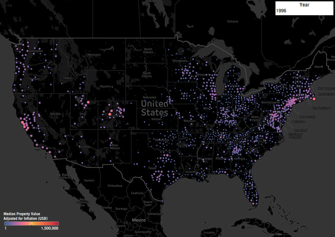
You're not crazy, housing REALLY is more expensive than it used to be! Below is a map of median property values adjusted for inflation (sourced from Zillow's API) in Tableau for analysis. The analysis spans 1996 to 2018 looking at median values by county. You'll notice, many rural or semi-rural counties have a marginal increases - most of the impact is experienced on the coasts. Denver and Seattle metros also appear to explode over the past 2 decades. It's not hard to also see the market crash in 207-2012, but, for the most part the market recovers completely by 2018.
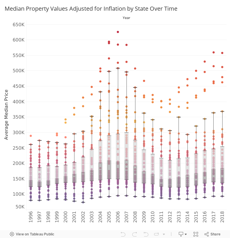
Digging further, not every state has experienced the same shifts, even adjusting for the noise of higher priced counties. In the below graphic you can see each state. You can interact with the graph to better understand each state over the past few years. Again, you can visually understand when and where the Great Recession occurred and how it impacted your state. To view these dashboards, check out my Tableau Public page.
0 Comments
Leave a Reply. |
Tom SeipleI write about planning, design, urbanism, social issues, and history. Archives
May 2018
Categories |
 RSS Feed
